
How to Style a Patterned Tablecloth with Grace
A Guide to Floral Reverie
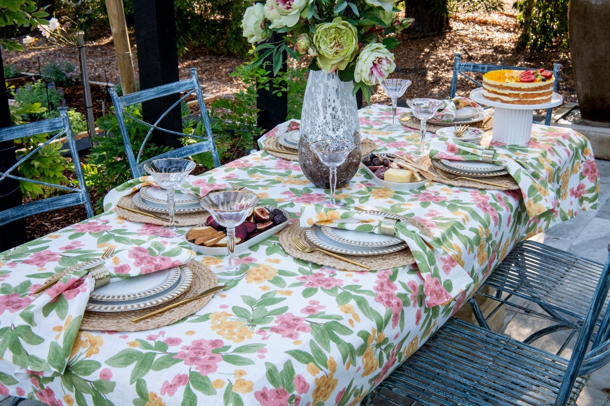
There’s something undeniably joyful about a bold, blooming tablecloth — especially one that bursts with green leaves, pink and golden yellow florals. At Shared Plates, we believe colour and pattern should be celebrated, not tamed. But when styling a vibrant foundation, it’s important to let the supporting elements work with it — grounding it, softening it, and drawing out its best features.
Our Floral Reverie tablescape captures this balance — where colour meets elegance, and pattern meets poise. Here’s how to style a bright floral cloth with intention, layering in texture and tone to create a setting that feels inviting, not overwhelming.
Start with the Statement Piece
Your tablecloth sets the mood — and this one does it boldly. A vibrant design in green, pink, and yellow, with leaf and flower motifs, creates energy and joy. It brings a garden-party feel to the table, even indoors. Let this piece be your centre — everything else should work in harmony to support it.
Ground the Look with Natural Jute Placemats
A round or oval jute placemat introduces a natural, earthy texture that balances the colour above. The rough weave contrasts beautifully with the soft florals and provides a visual “pause” for the eye at each setting. It's like adding soil beneath your blooms — grounding, necessary, and warm.
Layer in Napkins: Patter, Pink or Earthy Green
Choose napkins in the same patter as the tablecloth, warm blush or olive-toned green — all options echo the tones in the tablecloth without competing.
-
Floral pattern creates elegance complimenting the statement piece
-
Blush pink adds softness and romance.
-
Earthy green leans into a more grounded, tonal look.
You can loosely knot the napkins, fold them under the plates, or tuck them through minimal napkin rings for a relaxed yet styled finish.
Use Cream Ceramics with Subtle Antique Details
For your plates, reach for cream-toned ceramics with a crackled antique finish on the base and a rippled edge in soft coffee brown. These details add elegance without shouting. They echo the tones of the tablecloth while their simplicity allows the cloth’s vibrancy to take the lead.
Add Golden Accents: Cutlery & Glassware
Bring in a hint of subtle glamour with gold cutlery — brushed rather than high-shine for a more refined look.
Pair with rippled glassware — wine or water glasses with a delicate gold rim. The ripple mirrors the motion of the florals, while the gold ties in with the yellow in the tablecloth.
Florals: Keep it Delicate
Because the cloth already sings with pattern, any centre floral arrangements should be low and delicate:
-
Think single-toned blooms (like light green with a hint of soft pink)
-
Or forgo flowers entirely and style with textural elements like ceramic or glass candlesticks.
Final Styling Touches
-
Add soft taper candles in ivory, blush, or pale yellow to complement without clashing
-
Consider layering in neutral ceramic or wooden serving pieces to bring down the colour intensity if needed
In Bloom, In Balance
Floral Reverie is about celebrating colour without chaos. When done thoughtfully, a bright tablecloth can become the heartbeat of your entire setting — uplifting, joyful, and perfectly balanced by the textures, tones, and details around it.
So next time you feel drawn to that bold piece in your linen drawer, go for it. Let it sing — and let everything else hum gently in harmony.
Share